Dear PT,01 / 05
Imaginative
Leads with the unexpected idea, then shows how it works.
never vagueHow Tinkertect looks, sounds and behaves. Robin's egg blue, chocolate and ivory; a serif with a curl in its tail; and a sense of humour that always reads the fine print.
01 — Essence
The brand idea
Tinkertecture is the art of applying detail to visualization, with imagination, to create original and practical solutions. Every expression of the brand should prove both halves: something you didn't expect, made with care you can see.
Leads with the unexpected idea, then shows how it works.
never vagueA doctor's eye: nothing is decoration unless it earns its place.
never fussyWinks often. Blows kisses at cameras. Footnotes the joke.
never sillyQuiet confidence, generous space, materials that feel expensive.
never cold02 — The wordmark
High-contrast letters, a swash on the k, and a © tucked into the T like a signature. The copyright mark stays: it's the brand's wink at its own disclaimer.
Don't stretch or squash
Don't recolour off-palette
Don't add effects
Don't set on busy patterns
03 — Colour
Robin's egg blue is the signature. Cocoa does the talking. Ivory gives everything room to breathe. Gold is a garnish, never a meal.
Her colour. Use it big: backgrounds, covers, moments of arrival.
From the “Vintage Sisters” chocolate moodboard. All type, all marks.
The page. Ebony & Ivory, minus the ebony.
Gold 5 · the garnish
| Cocoa on Egg | 9.3 : 1 · AAA |
| Cocoa on Ivory | 12.7 : 1 · AAA |
| Egg on Cocoa | 9.3 : 1 · AAA |
| Gold on Cocoa | 5.0 : 1 · AA |
Never set text in Egg or Gold on Ivory.
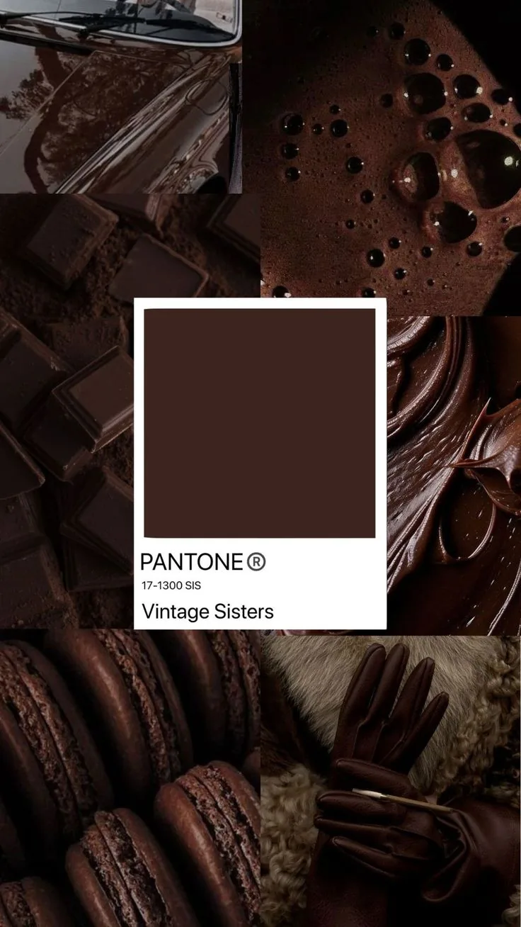
The brown isn't just brown. It's molten chocolate, a vintage car's lacquer, leather gloves and macarons: texture you can almost taste. Let the cocoa carry that warmth, and let the blue keep it light.
04 — Typography
Fraunces is a variable serif with axes for weight, softness and a deliberately “wonky” italic. The brand uses that range on purpose. Try it.
Light (300) at large sizes, italic with Soft and Wonk turned up for emphasis. Optical size follows the point size.
Detail first, imagination always.
Clean and warm. Regular for reading, Medium for buttons. Never in all caps; that job belongs to the mono.
Creative direction, visual storytelling and health communication, written plainly and set with plenty of room around it, the way a good doctor explains a diagnosis.
Uppercase, tracked out, small. It's the architect's pencil: section numbers, captions, dimensions.
§ 03 — Fundamentals
Fig. 1 · The Tinkertect
16 × 8 ft · Growth span 20–25 yrs
Her hand, more or less. Use once per page at most, for a signature or a handwritten aside.
mini me, watching
05 — Motifs
Each motif comes straight from the name: a robin's egg for the colour, an arch for the architect, the annotation for the tinkerer, and the dictionary entry for the woman who coined a word.
Cocoa flecks on robin's egg blue. Use as texture on blue fields, never on photographs.
Portraits sit in arches: a doorway, a window, a frame. Add a hairline ring for ceremony.
Section marks, figure numbers, dimension lines in mono. The tinkerer's working notes, left visible.
tin·ker·tect
/ˈtɪŋkətɛkt/ · noun
1. An individual with a highly developed imagination…
Headword, phonetics, part of speech, numbered senses. For moments where the brand defines itself.
06 — Mini me
A chibi Jemima with a curly puff and a gold headband, in the brand's blue and cocoa. She follows the pointer, reacts when booped, and dozes off if you ignore her.
07 — Voice
She writes like she talks on a good day: clear enough for a patient, playful enough for a creative, and always reading the fine print with a raised eyebrow.
08 — Imagery
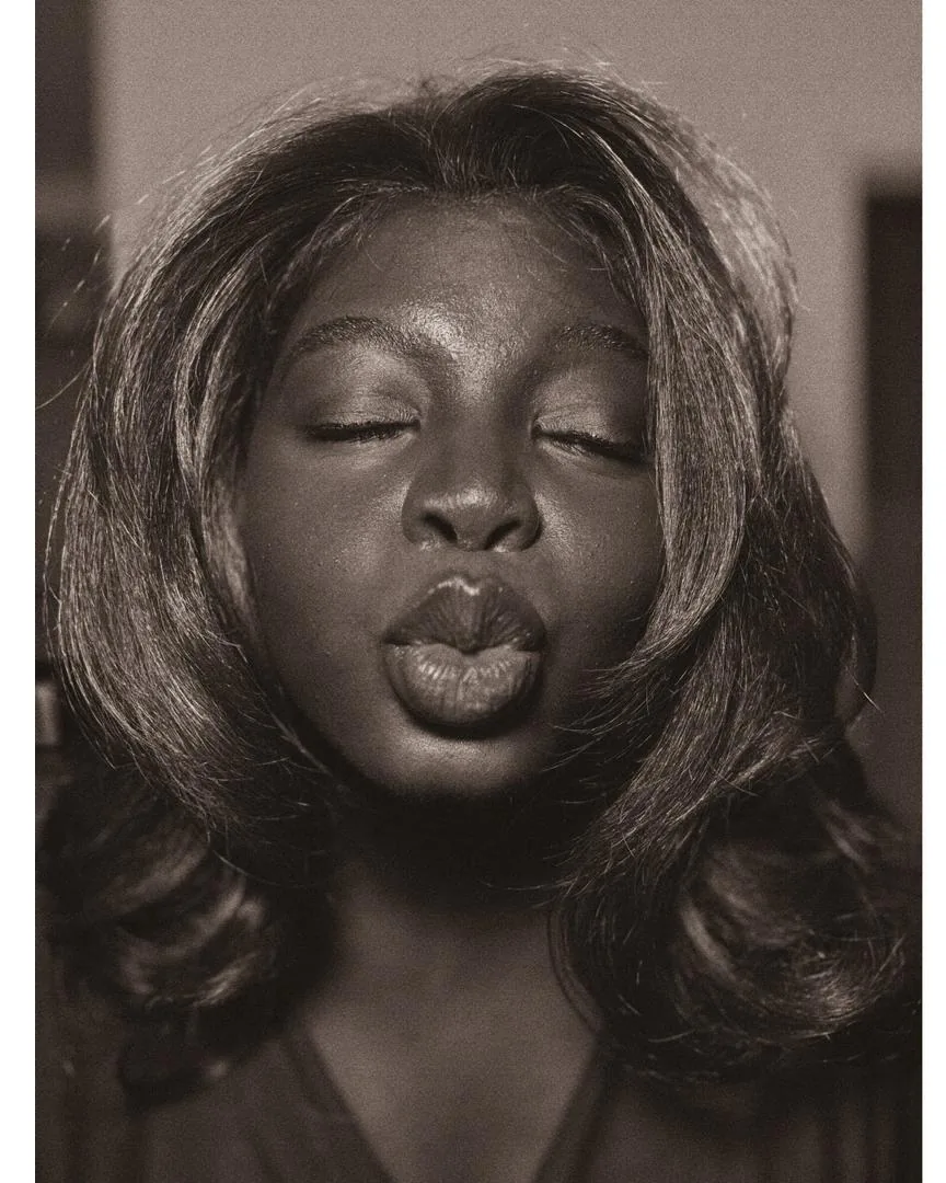
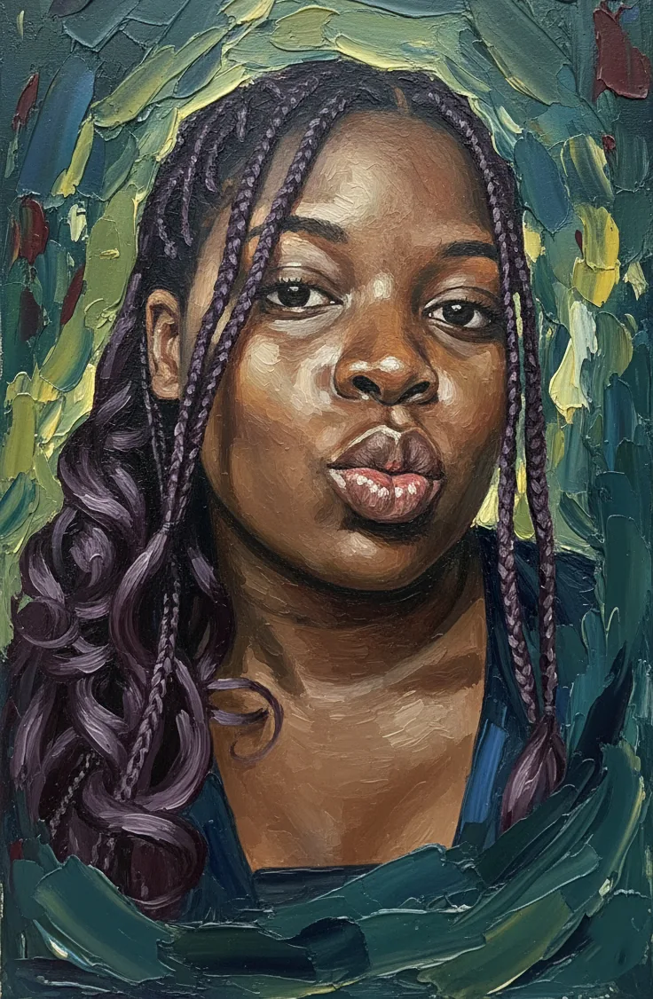
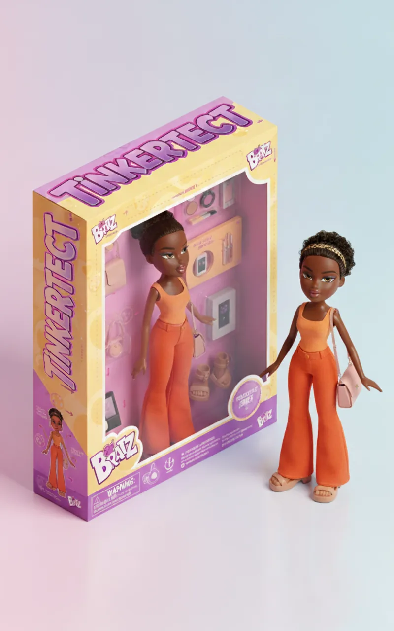
Three registers, all warm: sepia portraiture, painterly texture, and play. Avoid cool, clinical stock photography, even for health content.
09 — In use
One big idea,
taken with detail.
Business card · front & back
“Prescription” notepad
Health carousel template